Enhancing Vanguard’s Education MVP
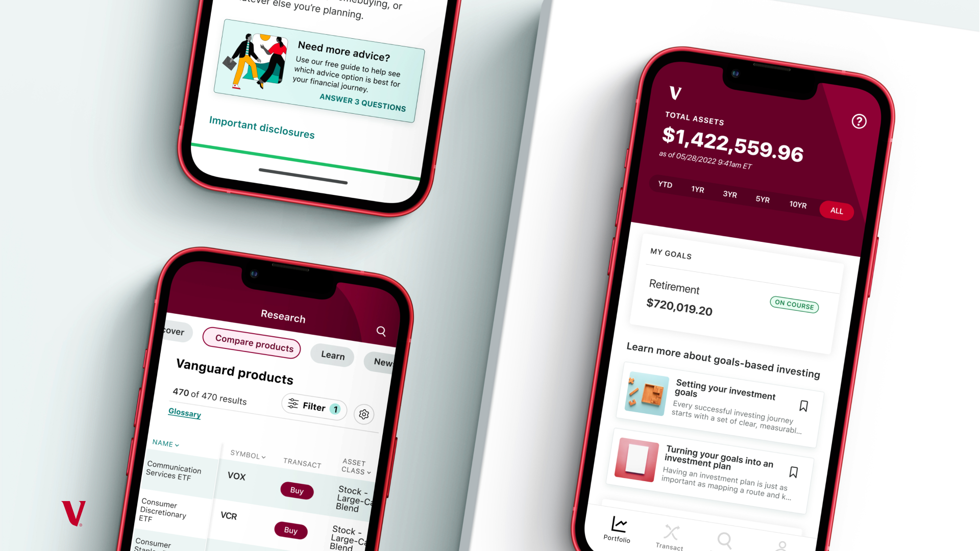
Action Cards: Providing clear, actionable steps towards financial success, while shaping the path to advice.
Problem statement
While users enjoy the education feature, they have few ways to move from engagement to actionable next steps, impeding their progress towards their investment goals.
During a round of user interview testing, my team (Education) and my design partner’s team (Research) collaborated with our UX researcher to evaluate our respective new feature designs. Our focus was on conducting routine interviews to have target clients evaluate the up and coming Education feature MVP.
During these interviews, we not only learned out to iteratively improve our MVP design, we uncovered significant gaps in the app-wide user journeys that demanded attention if we were to meet the objectives set by our organization’s mission.
“Our core purpose is simple—to take a stand for all investors, to treat them fairly, and to give them the best chance for investment success.”
— Vanguard’s mission statement
Education Feature MVP (at a glance)
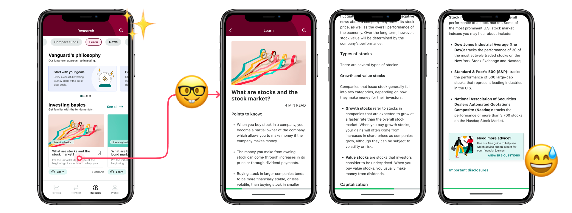
Increasing user knowledge, our Learn (education) feature offers curated articles and learning paths, promoting financial literacy for clients, contributing to informed decision-making and financial empowerment—enhancing confidence, engagement and growth.
Research uncovered
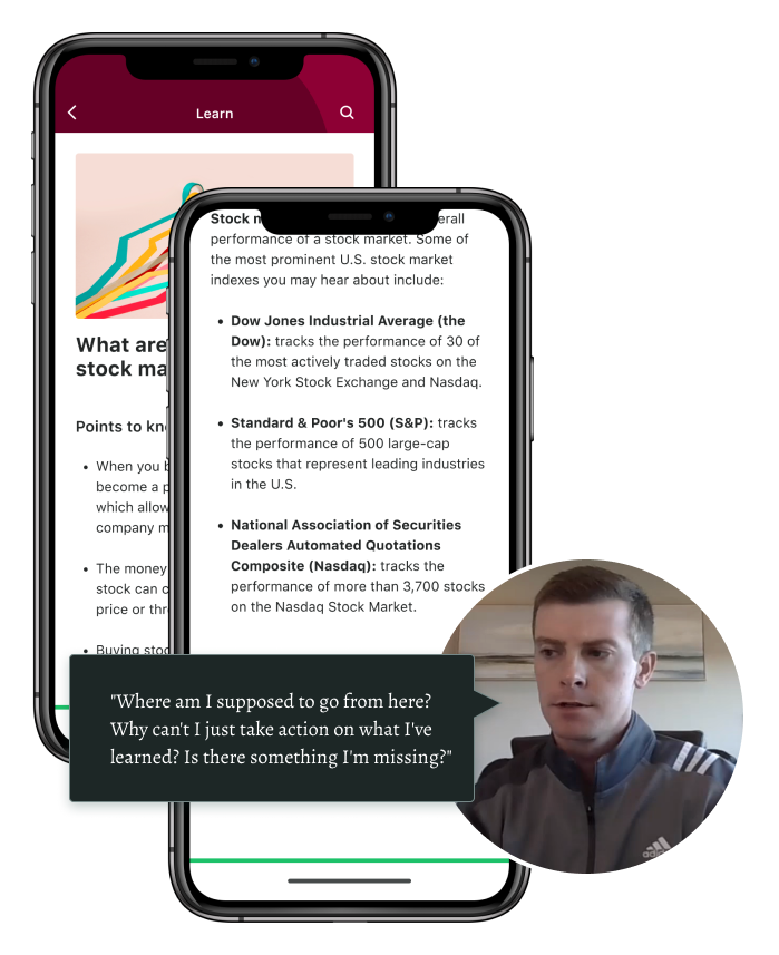
Clients felt frustrated by the lack of clear actionable steps within the app,
leading to confusion and hesitancy in their financial decisions, as they navigated fragmented journeys with dead ends and drop-offs, which hindered their ability to seamlessly transition from learning about investing topics to taking immediate action (actually making the forward progress they desire).
Client (User) Pain Points
Lack of Clarity
Users expressed frustration with the lack of clear guidance and actionable next steps within the app, leading to confusion and hesitancy in their financial decisions.
Limited Actionability
Users desired the ability to seamlessly transition from learning about investment options to taking action, such as opening an account or exploring specific products.
Fragmented Paths (Journeys)
Users encountered consistent dead ends, drop offs and bottlenecks throughout the app flows, resulting in a disjointed and frustrating experience as they navigated through the app.
Client (User) Needs
Clear Guidance and Nudges
Users sought clear and concise guidance within the app to help them understand their financial options and make informed decisions, along with nudges that prompt them towards their goals.
Integrated Actioability
Users expressed a need for seamless integration between educational content and actionable features, allowing them to apply what they've learned directly within the app to progress towards their financial objectives.
Streamlined User Journeys
Users desired a more cohesive and streamlined journey within the app, with fewer barriers and interruptions, to enhance their overall experience and facilitate smoother navigation towards their outcomes.
Business/Product Needs
Improved Engagement
There was a pressing need to increase discoverability and engagement within the research and education section of the app to ensure that clients have access to valuable resources that support their financial literacy and decision-making.
Drive Advice Adoption (Growth)
The organization aimed to drive adoption and growth of advisory services, making it the primary objective for 2024. This initiative was crucial for providing personalized investment guidance to clients and capitalizing on revenue opportunities.
Connected User Journeys
The organization aimed to enhance user journeys by bridging gaps and providing actionable next steps towards financial goals, regardless of the user's location within the app. This integration of actionable features was crucial for improving desired outcomes.
How might we…
...create streamlined and connected user journeys throughout the app that include actionable guidance throughout the app and inroads to Advice (starting where we could: Research & Education)?
Defining Success: Principles & Product Requirements
Seamless integration of Education and action (Discover, Engage)
Ensure that users can effortlessly transition from learning about financial concepts to taking practical steps towards their investment goals within the app.
Product Requirement: Enable users to seamlessly transition from educational content to actionable steps within the app, ensuring that learning opportunities are directly connected to practical actions they can take to progress towards their goals.
Drive advice adoption through guidance: (CX Alpha)
Increase the uptake of advisory services by delivering personalized recommendations and guidance that resonate with each user's unique financial needs and aspirations.
Product Requirement: Implement personalized recommendations and guidance tailored to each user's financial situation and objectives, aiming to increase advice adoption rates by providing relevant and valuable insights that resonate with individual needs.
Consistent User Experience Across Channels: (OneVanguard)
Maintain a cohesive and intuitive user experience across different sections of the app, providing users with seamless journeys and reducing friction in navigation/interaction.
Product Requirement: Maintain consistency in design and functionality across different sections of the app, ensuring that users encounter a cohesive experience regardless of where they navigate within the platform. This includes standardized navigation/UI patterns.
Q: Is this the right opportunity to introduce an appwide strategy?
We knew we wanted to make a push for breaking down siloes, collaborating more across teams, strategizing more holistically, etc BUT we also know there might be pushback as feature teams might be resistant to allow designs created “without” integrated into their section of the app.
A: Yes! But since our purview only included the Research & Education section of the app, we knew that we were constrained to introducing design solutions that we could develop in our respective feature sections of the app (even if the end goal was to recommend an appwide solution).
As a result, we decided to start where we could and include an additional layer of how the designs could scale appwide if the other feature teams had the appetite to collaborate on the effort.
Designs
Outroads from Education articles
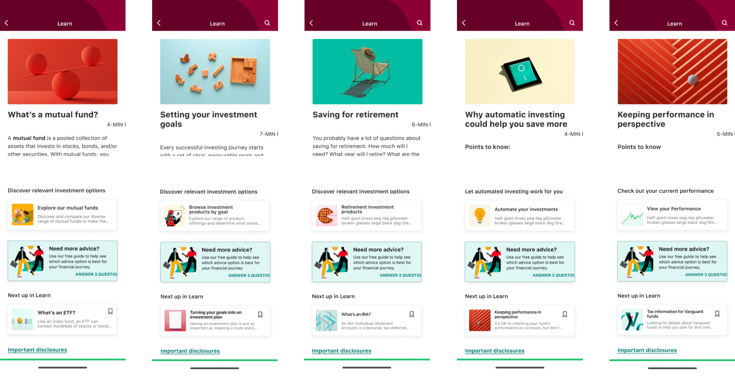
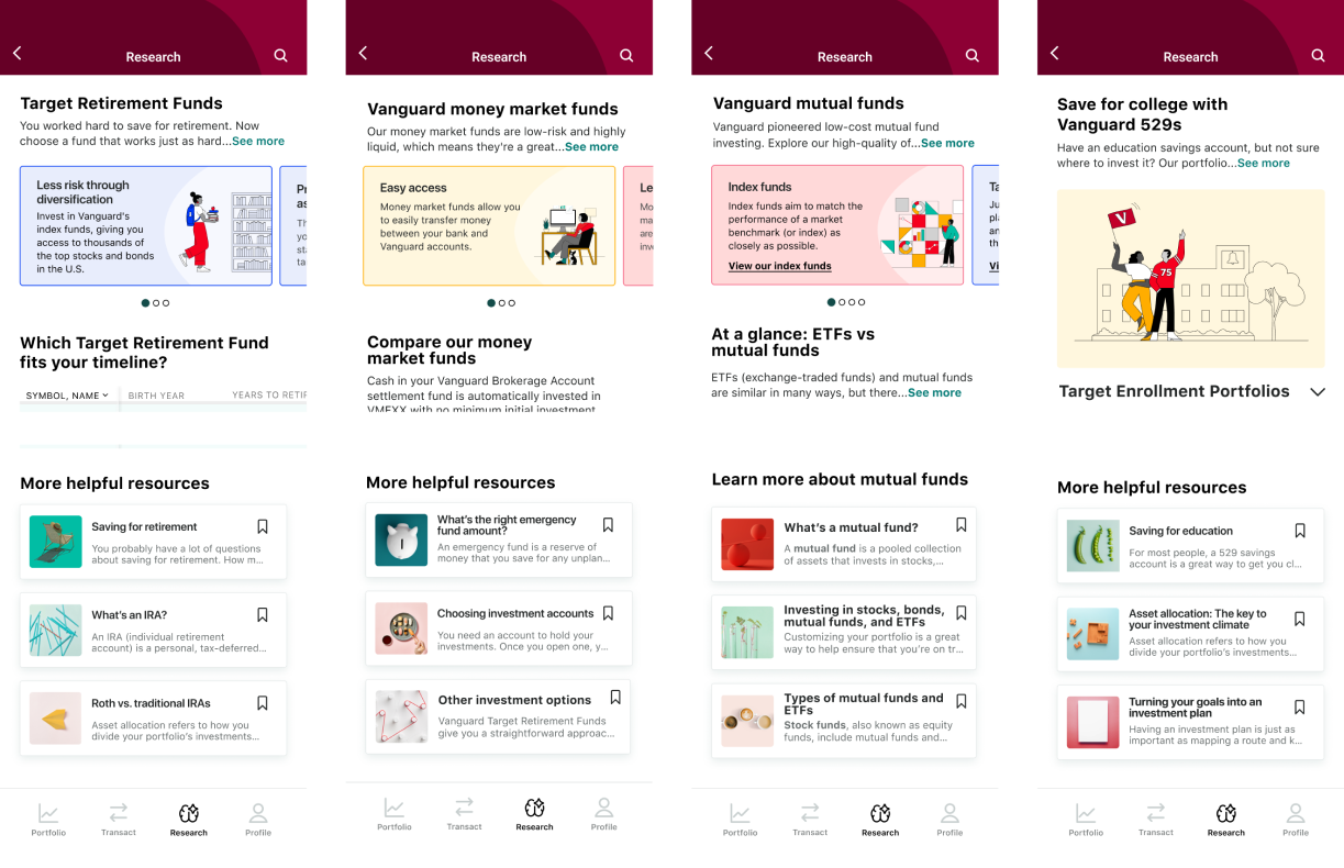
Inroads to Education articles from Browse (within Research)
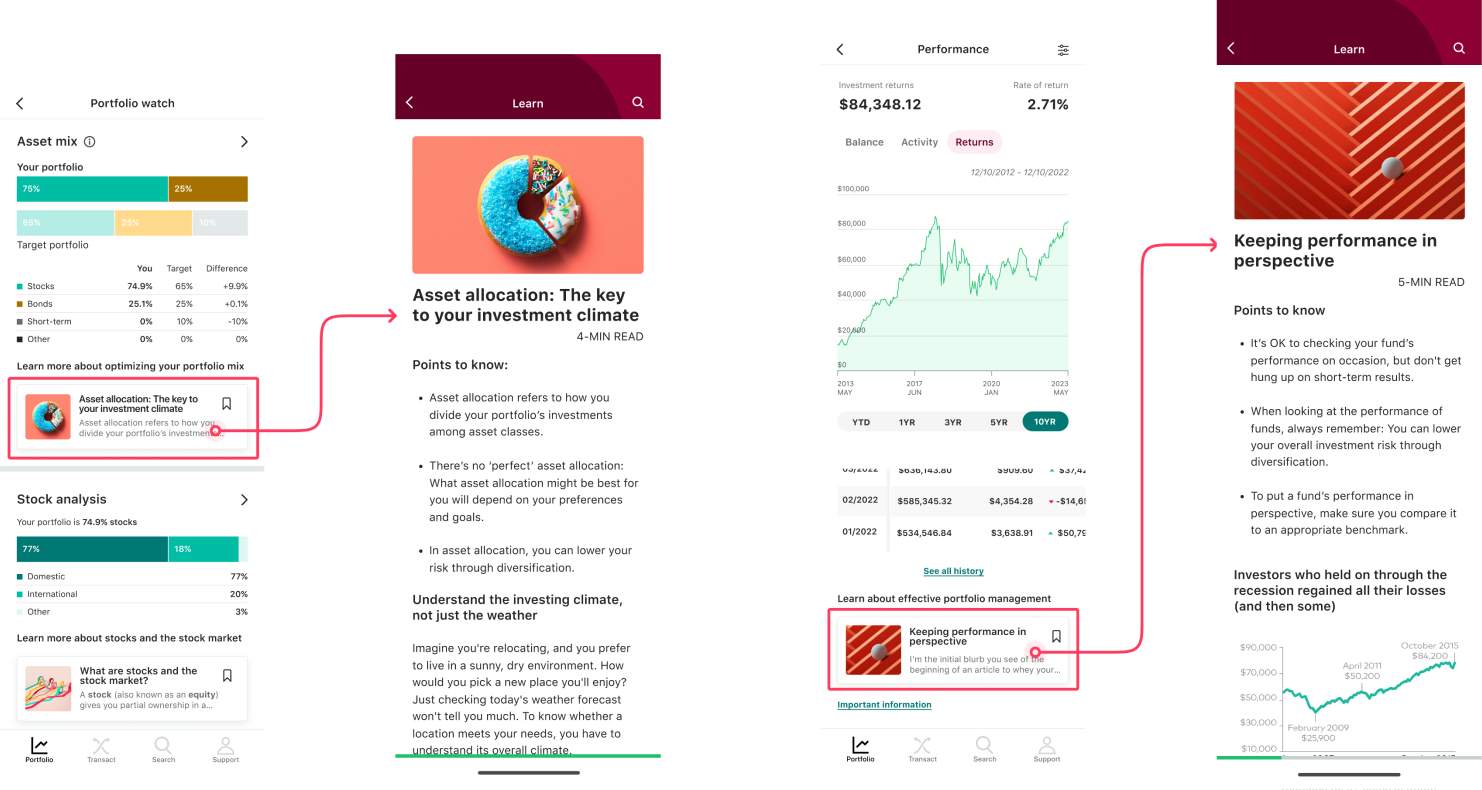
Inroads to Education articles from outside Research (appwide application)
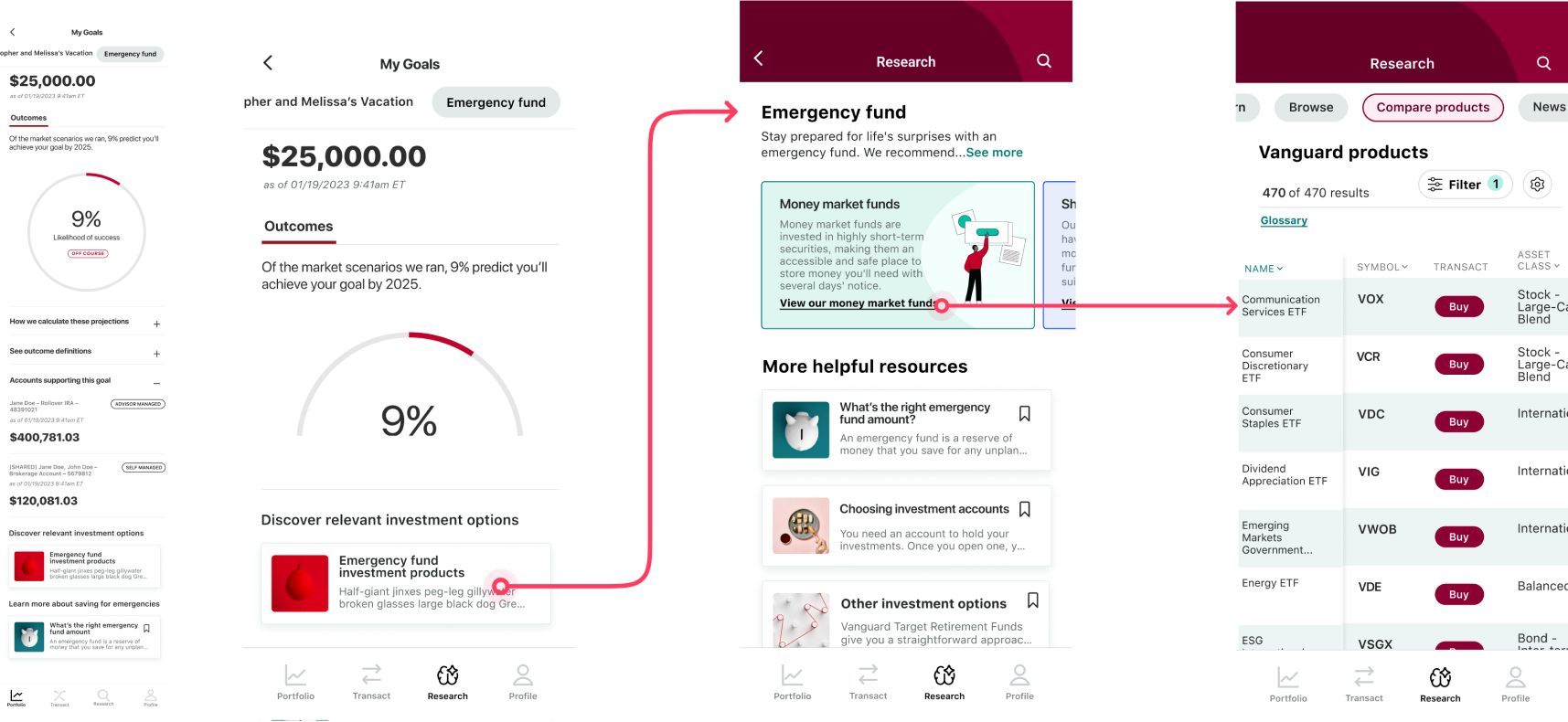
Putting it all together (appwide application) for cohesive client journeys
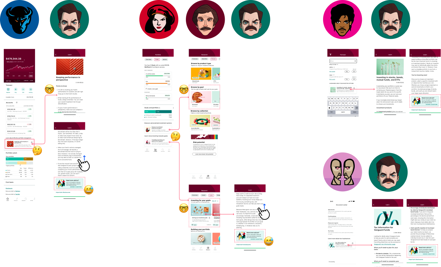
Highlighting cross-team collaborations visually
Results & Outcomes
Currently in development/Anticipated Outcomes:
Improved Discovery, Engagement
Increased discoverability and utilization of educational resources within the app, leading to greater financial literacy and confidence among users. This leading to improved user engagement and satisfaction based on user feedback and testing of proposed design concepts.
Drive Advice Adoption (Growth)
Enhanced alignment with organizational goals, including driving advice adoption and growth, streamlining user journeys, and fostering a more cohesive cross-channel experience.
Valuable Data, Client Insights
Establishment of a foundation for future design iterations and enhancements based on user insights and evolving business needs which will likely include branching our design strategy from localized experiment to appwide pattern.